
Online Identity Help Center
UX Research and Design Assistant
September 2021 - Present
Skills: Usability Testing
Deliverables: High Fidelity Prototype, Wireframes, Affinity Map, Persona
Software: Figma, WebFlow, Slack, Qualtrics, Zoom
How might we…
… create a platform to advise marginalized communities about their rights online?
Research
I analyzed interview transcripts to develop an affinity diagram showing common themes that frustrated users when learning about content moderation. We then created a journey map to represent the pain points marginalized folks have when learning about content moderation.
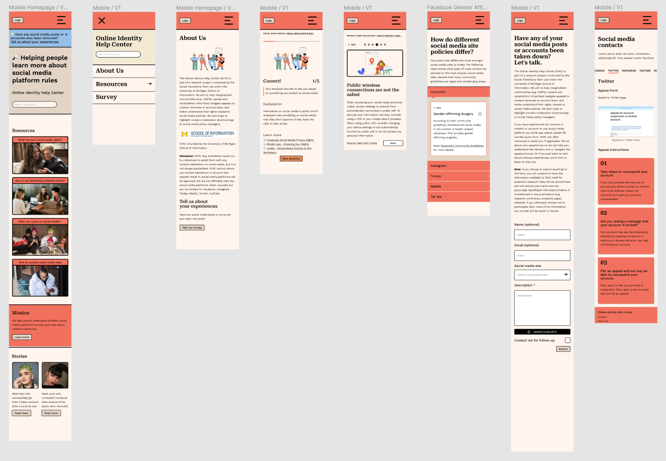
My team created wireframes and our first prototype on Figma with this information. Our affinity diagram showed that users wanted information presented in an interactive and succinct format. I included drop-downs, quizzes, and slide cards in our resources instead of using a typical article format to help users engage with the material. We also noticed a large decline in experience after someone's post was taken down, so we focused our resources on what you would look for after your post was taken down. For example, what rules lead to your post getting taken down, and how you can contact a social media site if you think your post was wrongly moderated.
Design Revisions
We then conducted 6 usability tests with potential users.
Half of our participants disliked our color palette. Many people associated our palette with the government, which made it hard for users to trust our website. This inspired us to change our color palette. Since the primary audience of our resource is marginalized individuals, we wanted to ensure all of our users felt safe and trusted our information.
Another thing I found in this round of user tests was that, while our information was a good length, the lack of content made some information confusing. Since we were working with complex topics, we teamed up with the Harvard Cyberlaw Clinic and Salty World to ensure our content was as clear as possible. This resulted in much longer descriptions, which caused contention because we knew users wanted succinct information. To solve this, we created buttons allowing users to reveal a longer description if the short one is insufficient.
Mobile Interactive Prototype
Next Steps
A few months after the website was deployed, we noticed low engagement from users, who weren’t staying on the website for very long. To increase engagement and encourage users to spend more time on the website, we added a carousel above the fold so users could quickly see all our resources. We also created a featured resource section as another way for users to find what they want.